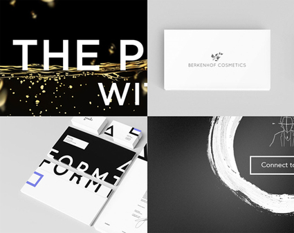
Must Design
75.6K views | +0 today
Must Design
Design Is Revolutionary
Your new post is loading...
Suggested by David Fournier
Scoop.it!

Web Design Trends 2015 [Infographic]

Web Design Trends 2015 [Infographic] | Must Design | Scoop.it
Explore the top web designing trends for 2015. The infographic discusses the top 6 predictions that are set to rule the web designing world in 2015.
Martin (Marty) Smith's insight:

Liked and agreed with all 6 of these 2015 Web Design Trends when I read the post without the infogfpahic. Infographic helps and I bet wil get more shares :). M

malek's curator insight, December 8, 2014 11:24 AM

I like“Card” design, no, it\s not new, but I find it a good tool for designers working on responsive websites. Cards are a great way to keep things modular

Scooped by Martin (Marty) Smith
Scoop.it!

The Hottest Web Design Trends of 2014: Updated | JUST™ Creative

The Hottest Web Design Trends of 2014: Updated | JUST™ Creative | Must Design | Scoop.it

An updated look at the hottest best web design trends of 2014 including a showcase of modern web design inspiration.

Marty Note
This @justcreative post hit many nails on the head when it was initially published and Jacob's update of Helga Moreno's post doesn't disappoint either. Things I REALLY agree with:

See Less of (PLEASE):

* Stock photography (no photos? ASK your employees / followers for help but please no more Stepford people in pics on websites).
* Flash (has killed more #seo and sites than you can shake a stick at and fact it is still alive is amazing).
* Capcha - spam sucks but so do capcha forms.

More of PLEASE:

* Content First (implied in Responsive or Mobile First Design is a new way of thinking about, tagging and presenting content).
* Interactive Exploring (BIG AGREEMENT see my post about Time is Money Online https://plus.google.com/+MartinWSmith/posts/RdjAjWoJTHw and tag this next to #gamification).
* Arresting pictures and Video (YES, your great content will be ignored or under-shared UNLESS it is paired with strong visual hooks and supports).

Great post by Helga for Just Creative and so TRUE to our experience of web dev in 2014 for leading ecommerce clients such as Moon Audio.com.

No comment yet.
Scooped by Martin (Marty) Smith
Scoop.it!

How Responsive Web Design Works [Infographic]

How Responsive Web Design Works [Infographic] | Must Design | Scoop.it
This infographic illustrates what responsive web design is, how it works, and why you should make the switch.
Martin (Marty) Smith's insight:

Responsive Web Design 
Here is an email I wrote to a friend this morning about responsive:

NO ONE understands mobile seo btw (lol). Not a huge leap to think that what makes a site responsive could also confuse the spider. Could also HELP the spider since the re-imagining of the information architecture should do things like:


* Move from novels to linked snippets. 
* Rely on tags (tags are about to be HUGE because they create new dimensions into the data). 
* Can open a site's content for social (reduce distance between THEM [customers] and US [site creators / managers]).
* Create clear meta data (goes with connected snippets). 

That last bullet puts stress on current database thinking and tech. With this many windows into the same data a developer must know about how to cononicalize a URL (or the dupe penalties will be crushing). Responsive websites become an evolving puzzle. As new pieces get created they must fit the existing framework or blow the whole thing up. 

That said, I don't see any way BUT thinking mobile first from here on out. In the end that is going to be a good thing for all of us, but transitioning is a bear :). Marty 


Tony Guzman's curator insight, October 6, 2014 11:28 AM

This infographic describes what responsive website design is and how to best accomplish it.

Scooped by Martin (Marty) Smith
Scoop.it!

Responsive Web Design At Artifact Conference : Slow Loading & Bloated As Design Flaws

Responsive Web Design At Artifact Conference : Slow Loading & Bloated As Design Flaws | Must Design | Scoop.it

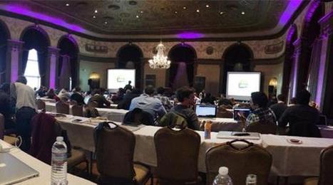
Last week, Jeremy Osborn, Academic Director for Aquent Gymnasium, had the chance to attend the Artifact Conference. Here are his key takeaways.

Marty Note
This Artifact Conference looks interesting and worth checkout out (http://artifactconf.com/ ). I love this quote from the Responsive panel at the conference in Providence, RI:

"On the other hand, responsive design is forcing companies to prioritize site performance. The consensus is that slow-loading and bloated sites are just as much of a “design” flaw as confusing layout, clashing colors, and the rampant proliferation of typefaces on page. "

Most designers focus on how to accordion a website so it looks good on any device. The real challenge is deeper. How do we architect "less bloat"? How do we design information to be lean and responsive?

Couple of things I've noticed include:

* Building stories via visuals and rich snippets.
* Taking advantage of the swipe and spin options on mobile devices.
* Creating easier to understand backend functionality.
* Using a LEAN or MEAN filter forcing messaging to get to the point FAST.

The SEO and engagement benefits of the second half of responsive design - the information architecture half - are enormous. We know that as engagement goes up so do our site's heuristics and the "new Google" loves more time on site, lower bounce rates and other "engagement metrics".

The "Responsive Challenge" for designers is to realize more is involved than look and feel. The very core of our communication must be reviewed, reevaluated and changed to be leander and more responsive too or we design dissonance in. Confused customers do many things converting is never one of them.  

No comment yet.
Suggested by David Fournier
Scoop.it!

Responsive Web Design 101 - Learning The Basics

Responsive Web Design 101 - Learning The Basics | Must Design | Scoop.it

Responsive web design is the practice of creating websites that display evenly on all devices. Understand the basics of responsive web design with examples.

Marty Note
Don't make the common mistake of thinking responsive design is all about look and feel. Yes some WordPress templates can make it FEEL that way since they are built to accordian with different receptions created by phone, laptop and computers.

The important idea for marketers to understand is to THINK Mobile First. Thinking mobile first brings a slew of changes such as:

* Flat web design.
* Limited Colors.
* Less functionality that is easier to understand.
* Content snippets instead of novels.
* Emphasis on VISUAL MARKETING.
* Need to make content & communication feel & act like a game.

Those last bullets speak to the gamification of marketing so implied by smartphones and a mobile / social / connected world. Mobile means never having to say you're sorry because you listen and curate more than you talk, create sustaining community and engagement and understand all the implications of "the network is the computer".

Just shared an overview of Marketing Timelines on G+ (https://plus.google.com/102639884404823294558/posts/EkXN57uJyjq ). All that said, you still need to understand Responsive Design 101 so appreciate this Scoop.it suggestion from @David Fournier. .

Scooped by Martin (Marty) Smith
Scoop.it!

Top 10 Web Design Topics of 2014 From Flat To Content & SEO

Top 10 Web Design Topics of 2014 From Flat To Content & SEO | Must Design | Scoop.it
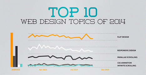
The "Web Design" category of general interest covers its fair share of ground. Informative articles on everything from UX to client management, to conversion psychology,...
Martin (Marty) Smith's insight:

YES, seeing all 10 of these trends from flat design to content ISN'T king anymore (not true) and SEO isn't getting easier (true).

No comment yet.
Scooped by Martin (Marty) Smith
Scoop.it!

65 Best Responsive Web Designs 2014 via SocialDriver.com

65 Best Responsive Web Designs 2014 via SocialDriver.com | Must Design | Scoop.it

Responsive Web Designs
Responsive design, forming a website's information so it looks great on any device, is becoming mission critical. Here are 65 of the best responsive designs in 2014 via SocialDriver.com.

Martin (Marty) Smith's insight:

I like Salesforce and SquareSpace and was surprised I didn't hate the Microsoft design.

Helen Stark's curator insight, September 30, 2014 3:53 AM

Unusual and creative responsive designs that look great on a huge monitor and a tiny smartphone screen - that's great